Client: Fiish Sushi & Sake
Project: Branding + Identity
Role: Designer
Fiish Sushi & Sake (Case Study)
Introducing Fiish: Where Culinary Craftsmanship Meets Timeless Elegance
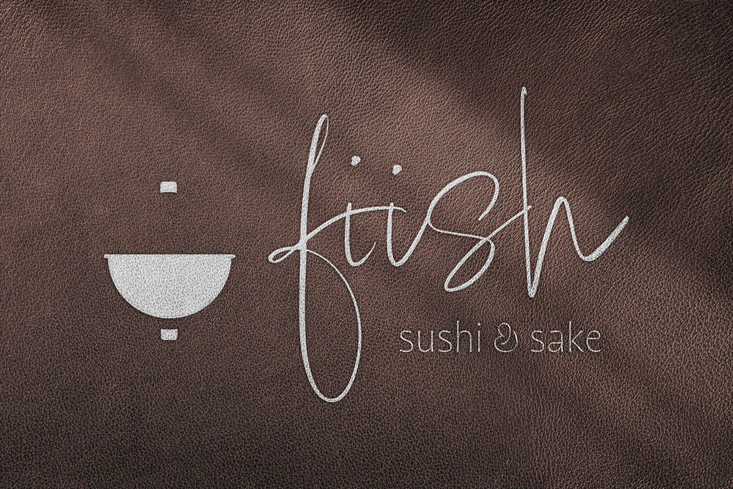
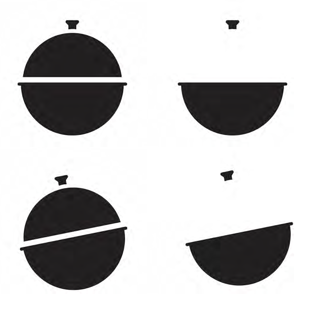
This project has truly been a transformative journey through my design skills and conceptual growth. Throughout its evolution, the original idea that I was set on for this project remained steadfast: the fusion of a sophisticated cloche, emblematic of fine dining establishments, with the charm and simplicity of a fishing bobber. After many hours of exploration, the use of negative space and Gestalt theory brought my vision to fruition in a timeless and versatile way.
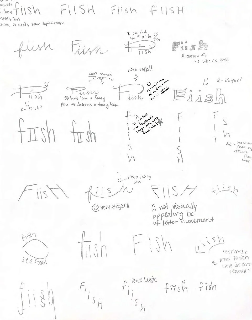

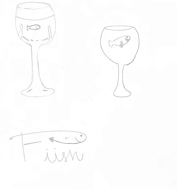


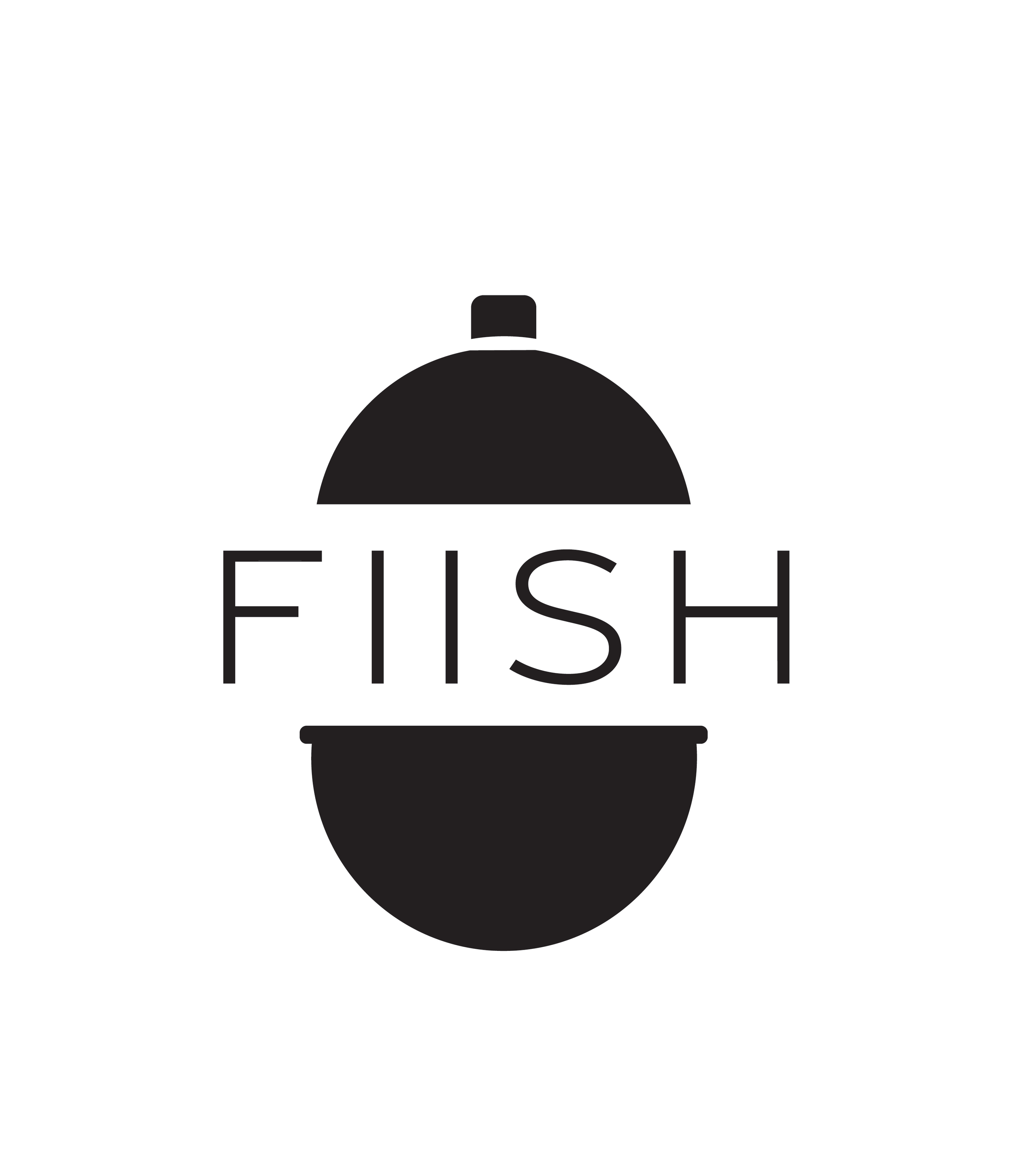


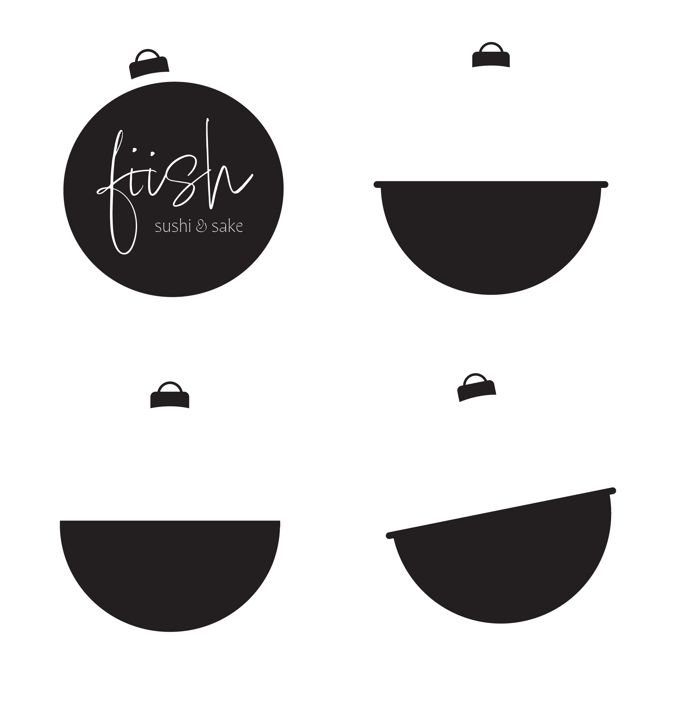
It quickly became evident that the use of strokes in this design should be avoided altogether in order for the design to appear professional and upscale. Additionally, maintaining a vertical use of the logo shape proved essential, as it began to resemble Pac-Man when positioned as though the cloche was opening to reveal some delectable nigiri. The initial typeface chosen for the project was also too thin, leading to visibility challenges when viewed on a smaller scale. Although the first iteration of the logo achieved my goals for this project, its effectiveness seemed somewhat lackluster in the long run. The elegant typeface effectively evokes some Japanese influence, aligning with the essence of a sushi restaurant. Nevertheless, the upper section of the "lid" did not appear fully developed, while the lower part seemed excessively bulbous.


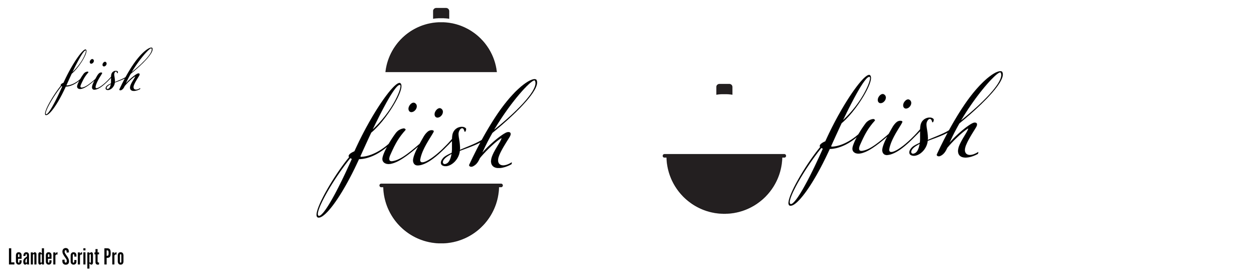

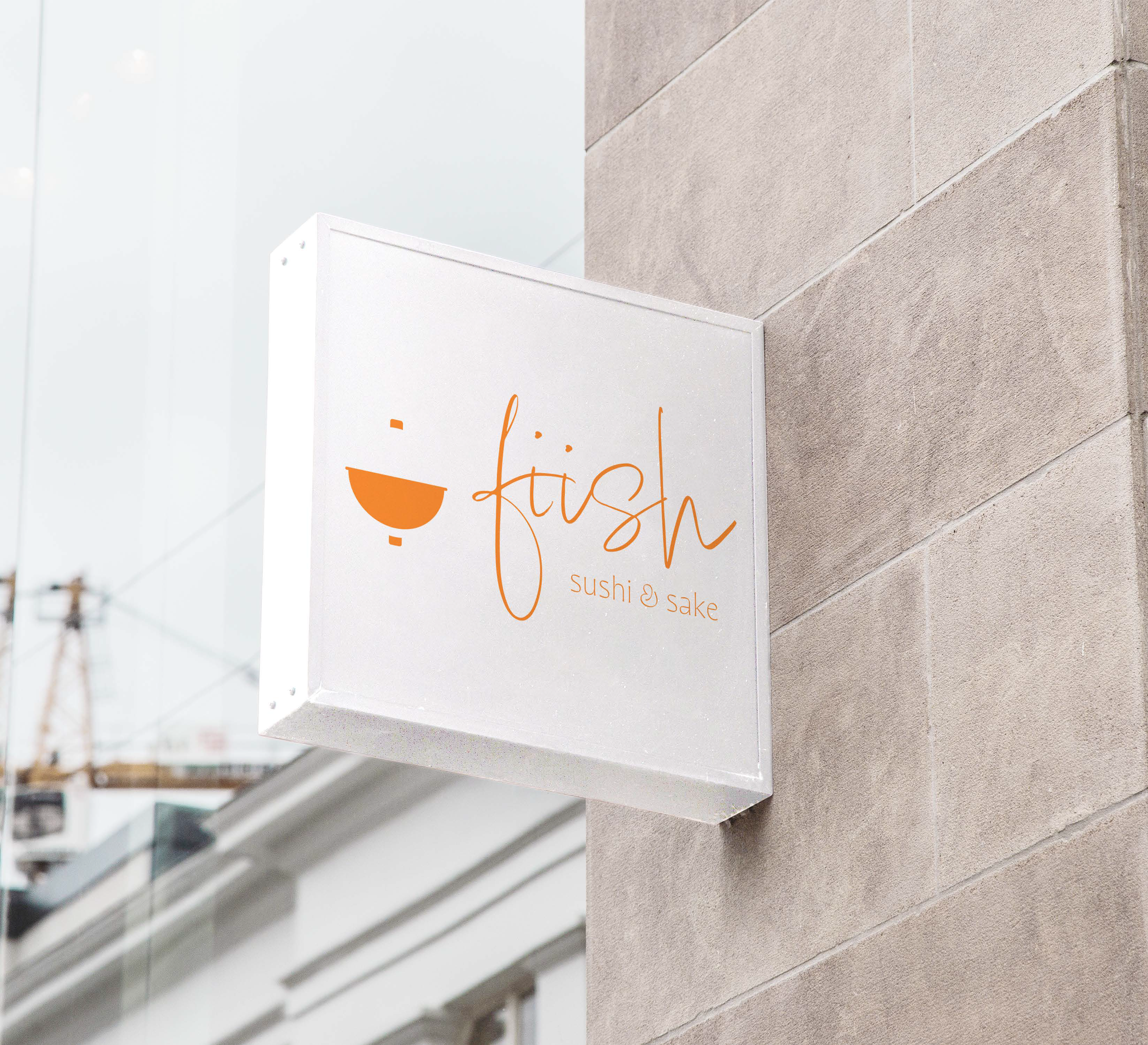
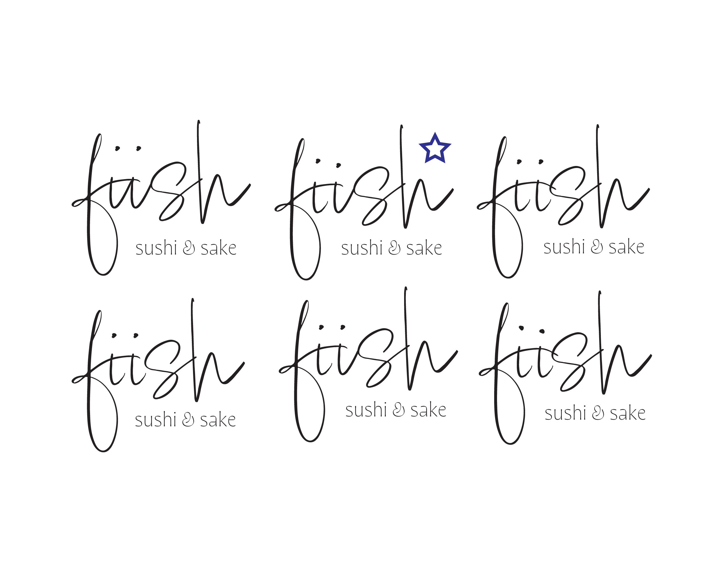
After thoroughly exploring different typeface options, I finally settled on one that most seamlessly aligned with the ambiance of the restaurant's distinctive brand. The execution of a script typeface with the layout I initially created caused me to gravitate towards a side-by-side layout instead. This solution also allows the icon to function alone and enhance the overall logo versatility. Consequently, this change also encouraged me to incorporate the phrase "Sushi & Sake" into the restaurant’s name, thus creating some extra pizazz with this complementary secondary typeface.
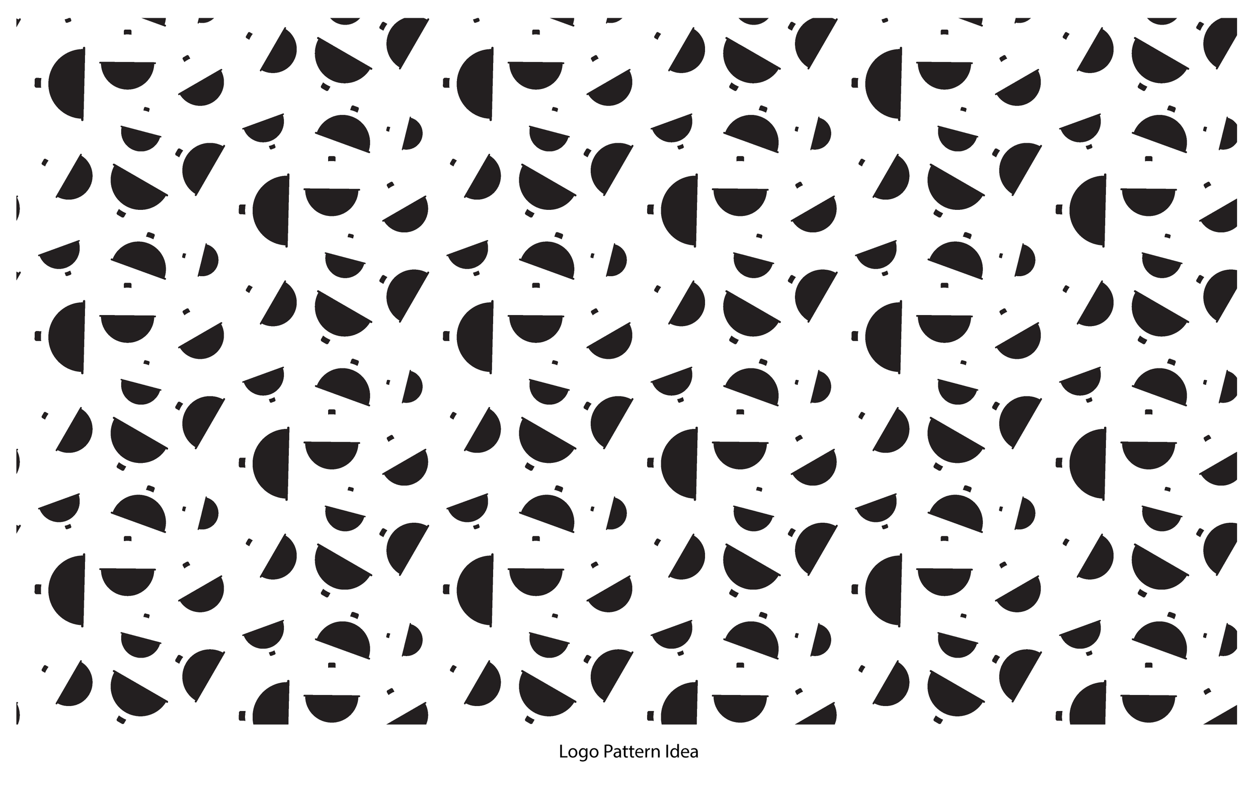
To further enhance the branding aesthetic, I designed various floral shapes by using smaller elements from the logo. Additionally, I envisioned a potential animation concept for the future by creating a simple, vector representation of a sushi rolling mat. In terms of the color scheme, I found that orange and blue best evoke associations with fishing, especially with the bobber component of the design. I settled on variations of these colors sourced from the original palette I curated. I also complemented these key tones with a subtle blonde color, while also incorporating tasteful gradients to add depth and visual interest to the artwork.


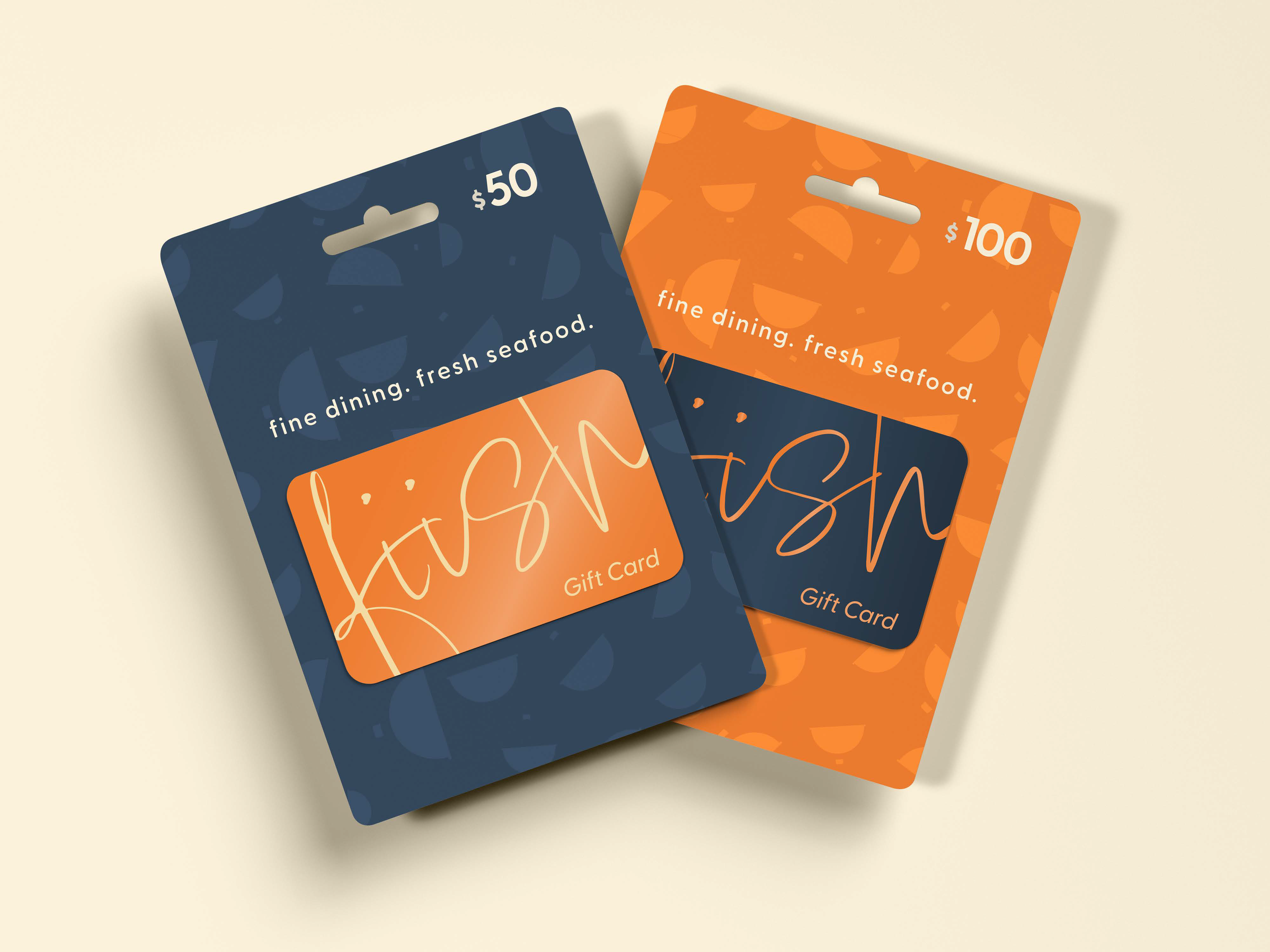
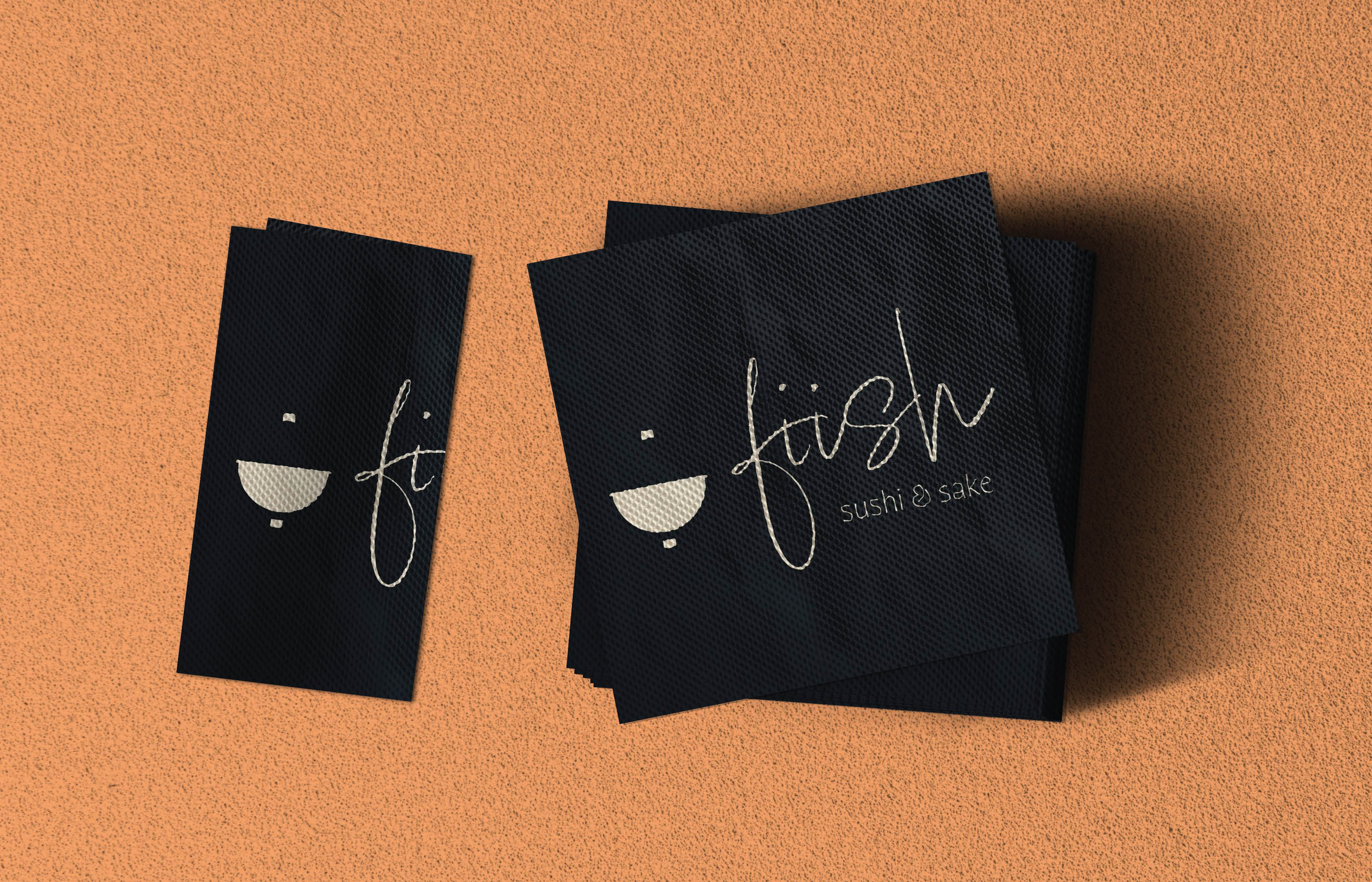
In an effort to show the versatility of branding materials, I created a vast array of mockups — such as take-out bags, chopstick wrappers, and gift cards. Then, I crafted a mock social media feed using online images to match the aesthetic of the brand with some light editing. The posts also work to highlight different events that could be offered at this establishment. The main branding guidelines, as well as options for the logo, imagery, typography, etc. are also discussed in a 4-page digital booklet.